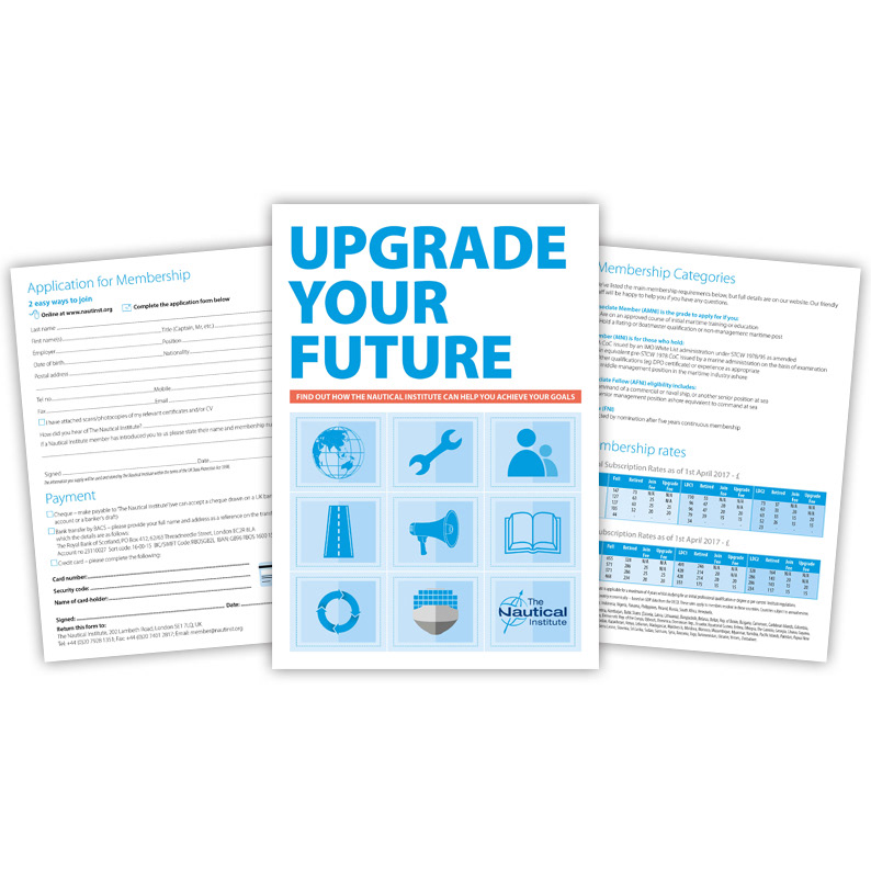
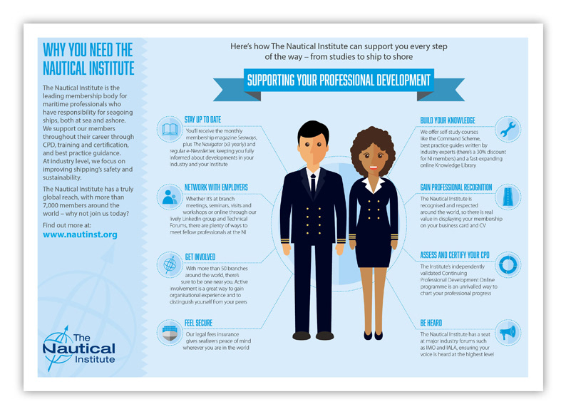
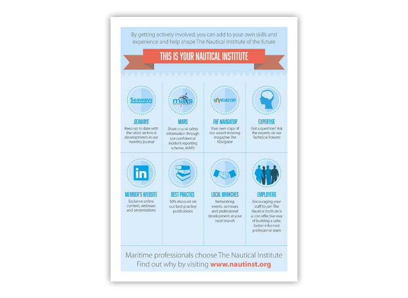
This interesting brief came from a long-standing client who needed help creating a membership brochure that could be used as a mail shot, an insert or as marketing and exhibition collateral. It was important they had something distinctive that could handle a lot of information and detail whilst arresting the eye with strong visuals and maintaining the corporate brand. I opted for a flat, 2D style so I could develop icons for each selling point and create a unique look for this specific sector. The colour and images keep the feel light but do so with a broad appeal, still maintaining a level of professionalism while simultaneously appealing to a younger audience. The icons are flexible and have been used in other projects, particularly on the website as signposts and navigation tools. The flat style has also been extended into other projects too saving a lot of conceptualising and design work, demonstrating the value of well thought out design and communication strategies and how they ultimately save the client money in the long term.